Dashboard
This document provides a detailed explanation of the sections displayed on the dashboard, helping users understand its purpose and functionality.
1. Vulnerabilities Graph
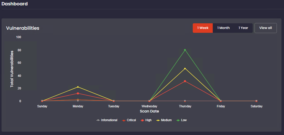
- Purpose: Displays the trend of detected vulnerabilities over time.
- X-axis: Represents the time period (e.g., months).
- Y-axis: Represents the total number of vulnerabilities.
- Legend: Different colors represent severity levels: Critical, High, Medium, and Low.
- Filters: Allows users to adjust the time range displayed using options like 1 Week, 1 Month, 1 Year, or View All.
2. Overview Panel
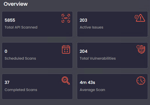
- Purpose: Summarizes key metrics about the scanning and vulnerability process.
- Sections:
- Total APIs Scanned: The total number of APIs that have been scanned.
- Active Issues: Issues detected but not resolved.
- Scheduled Scans: Number of scans scheduled to run automatically.
- Total Vulnerabilities: The total count of all vulnerabilities identified.
- Completed Scans: The number of scans successfully finished.
- Average Scan Time: The average time it takes to complete a scan.
3. Top Vulnerable Endpoints
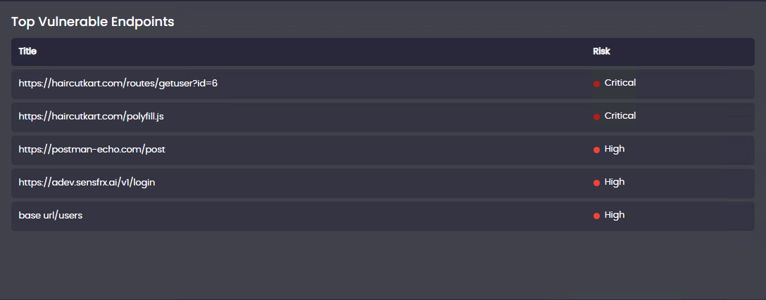
- Purpose: Lists the API endpoints with the highest number of vulnerabilities.
- Details:
- Each endpoint is displayed along with its URL.
- The risk level of each endpoint is highlighted (e.g., High or Critical).
- Use: Helps prioritize fixing vulnerabilities in the most at-risk endpoints.
4. Open vs Close Vulnerabilities Pie Chart
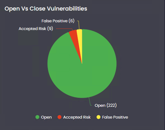
- Purpose: Provides a visual representation of the status of vulnerabilities.
- Details:
- Green represents vulnerabilities that are open.
- Red represents vulnerabilities that are resolved.
- Use: Quickly shows the ratio of unresolved to resolved vulnerabilities.
5. Recent Vulnerabilities
- Purpose: Displays a list of newly detected vulnerabilities.
- Details:
- Each vulnerability is listed with a unique identifier.
- The risk level of each vulnerability is highlighted (e.g., Low, Medium, High, or Critical).
- Use: Helps users focus on addressing the most recent issues.
6. Recent Scans
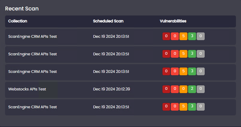
- Purpose: Lists details of the most recently performed scans.
- Details:
- Each scan is associated with a collection or program.
- Displays the scheduled time for the scan and the severity distribution of vulnerabilities found.
- Use: Allows users to monitor and review recent scan activities.
7. Risk Summary Heatmap
- Purpose: Visualizes the distribution of vulnerabilities based on their exploitability and impact.
- Details:
- The heatmap uses shades of red to indicate severity, with darker shades representing higher risks.
- The chart breaks down vulnerabilities into categories, showing the relationship between exploitability and impact.
- Use: Helps users identify areas of high risk and prioritize remediation efforts.
This dashboard is designed to provide a comprehensive view of API security, helping users identify and address vulnerabilities effectively. Each section serves a specific purpose, making it easier for users to monitor security status and take appropriate actions.